Why Colour Contrast Changes the Feel of an Outfit
Learn how lightness and colour intensity shape an outfit, then compare clothes you own to see which combinations feel crisp, quiet, or emphatic.
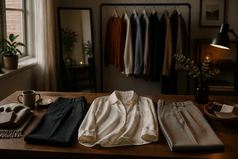
You pull on a cream shirt and dark jeans, then swap the jeans for pale gray trousers: the clothes are familiar, but the outfit feels different. Colour contrast is the difference between colours in lightness or intensity, and noticing it helps explain why combinations can seem crisp, subdued, or emphatic before you change a single garment.
What does colour contrast mean in an outfit?
Colour contrast describes how distinct neighbouring colours appear from one another. In clothing, the difference can come from lightness, intensity, hue, or a combination of these qualities. A pale blue shirt beside navy trousers has a clear light-dark difference; pale blue beside a muted gray-blue has less.
Contrast is relational, not a fixed property of one item. A rust sweater can look vivid beside soft beige and restrained beside deep burgundy. The garments stay the same, but their neighbours change what your eye notices.
Think of contrast as one part of an outfit’s visual language. It affects how strongly separate pieces stand apart, but it does not decide whether the colours are attractive, flattering, or appropriate. Those judgments also depend on personal taste, context, fabric, fit, and how much of each colour you wear.
How does lightness contrast change the mood?
Lightness describes how close a colour appears to white or black. A light garment beside a dark one creates a more pronounced light-dark division than two garments with similar lightness. That division can make an outfit read as crisp, graphic, or clearly segmented.
For instance, an ivory blouse with charcoal trousers has a visible break between top and bottom. Replace the charcoal with a medium gray, and the boundary becomes gentler. The first pairing may feel more emphatic; the second may feel quieter, even though both use neutral colours.
Neither effect is inherently better. Strong lightness contrast can help individual pieces register clearly, while a smaller difference can make a combination feel more continuous. Consider the impression you want before treating one as a rule.
Placement matters, too. A pale scarf against a dark coat creates a small, distinct contrast near the face. The same pale colour in a shoe may be less noticeable because it occupies a different place in the outfit and has less visual area.
What does colour intensity add?
Intensity, often called saturation, describes how vivid or muted a colour appears. A clean, bright red has more intensity than a dusty rose; a clear cobalt blue has more than a softened, grayish blue. A combination can have strong intensity contrast even when its colours are close in lightness.
Imagine a muted olive jacket over a vivid orange top. If both are about equally light, the outfit may still feel lively because the orange is much more intense. Put the orange with a muted rust instead, and the difference in intensity may shrink, making the pairing feel more blended.
Intensity can be difficult to judge from a product photo. Lighting, screen settings, fabric texture, and the colour of nearby garments all affect what you see. In a closet, compare pieces in the same natural light and look at the cloth itself rather than relying on a screen image.
Can two colours contrast in one way but not another?
Yes. A pairing may have little lightness contrast but a strong difference in hue or intensity. Conversely, two colours can be similarly muted yet far apart in lightness. Naming the kind of difference you see is more useful than calling an outfit simply “high contrast” or “low contrast.”
Consider a pale yellow cardigan with a pale blue skirt. Their lightness may be similar, so the outfit has a soft overall separation, but the hues are distinct. Now compare the same cardigan with a navy skirt: the lightness difference becomes prominent, even though both pairings contain two colours.
Colour contrast also shifts with proportion. A small vivid accessory against a large muted outfit may act as a noticeable accent. If vivid colour covers more of the outfit, it can become the overall impression instead of a small interruption.
How can you observe contrast with clothes you own?
Use a simple comparison rather than trying to classify every garment perfectly. Pick one item, then hold it beside several alternatives under steady daylight. A mirror or a phone camera can help you step back and see the outfit as a whole, but keep the camera’s colour rendering in mind.
- Choose a garment you wear often, such as a cream sweater, blue shirt, or dark skirt.
- Set out two or three possible partners that differ from it in lightness, intensity, or both.
- Compare one pairing at a time in the same spot, with similar lighting and no extra accessories.
- Look first at lightness: does one item clearly read lighter or darker, or do the pieces sit close together?
- Look again at intensity: does one colour seem cleaner and more vivid while the other seems muted?
- Step back and describe the impression in plain language, such as “sharp,” “soft,” or “lively.” Treat that description as a note about the pairing, not a verdict.
- Wear the combination in ordinary settings if you want to notice how movement, texture, and changing light alter its appearance.
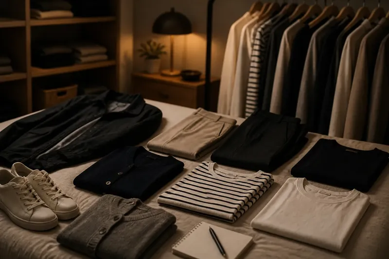
Say you have a soft gray cardigan and are deciding between a white tee and a charcoal tee. Comparing each beneath the cardigan in daylight could reveal that white creates a clearer light-dark edge, while charcoal keeps the outfit closer in lightness. The useful result is an observation about the impression each pairing gives, not a rule about which one you should choose.
It is not worth trying to assign exact colour values or buying special equipment for this exercise. A mirror, daylight, and garments you already own are enough to make a practical comparison.
Does a black-and-white photo help you judge contrast?
It can help you isolate lightness. A grayscale image removes most hue information, making it easier to see whether one garment is substantially lighter or darker than another. It cannot tell you how vivid, muted, warm, or cool the colours appear.
If you use a phone photo, take it in consistent light and compare the garments in the same frame. Camera exposure can brighten or darken the image, so treat the result as a rough visual aid rather than a precise reading. Looking at the clothes in person remains useful for intensity and texture.
How does fabric affect the contrast you see?
Surface and texture influence how a colour appears. A smooth satin-like surface can reflect light differently from brushed wool or matte cotton, so two fabrics in a similar shade may not look equally bright. A glossy surface may also draw the eye more than a textured, low-sheen one.
Pattern changes the comparison as well. A checked shirt can contain several lightness and intensity differences at once, while a solid coat presents a simpler field of colour. When a pairing feels unexpectedly busy, check whether a pattern is adding small contrasts throughout the outfit.
Compare garments in the light where you are likely to wear them. Outdoor daylight, shaded rooms, and warm indoor bulbs can alter the apparent relationship between colours. If a decision depends on the care label, manufacturer instructions, or a dress requirement, follow that information rather than relying on colour appearance alone.
What should you do if a combination feels too stark?
First identify what is creating the starkness. It may be a large gap between light and dark, a very vivid colour beside a muted one, or a high-contrast pattern. Once you name the source, you can adjust one element instead of replacing the whole outfit.
- Choose a middle-lightness garment to reduce a sharp divide between very light and very dark pieces.
- Swap a vivid item for a more muted shade if intensity is the main source of emphasis.
- Use a layer in a bridging colour, such as a medium neutral, to soften the transition between two strong colours.
- Reduce the area of the strongest colour by using it in a smaller garment or accessory.
- Keep the contrast and change the setting or styling if the sharper impression is what you want.
These are options, not repairs. A crisp combination may be exactly right for a structured look, while a softer one may better suit a relaxed outfit. Your own response matters more than an abstract ideal of harmony.
How can contrast guide colour choices without becoming a rule?
Use contrast to explain what you notice and to make deliberate choices. If a pairing feels too divided, reduce the difference in lightness or intensity; if it feels flat to you, introduce a clearer difference in one of those qualities. Change one garment at a time so you can see which adjustment matters.
It also helps to separate a preference from a prescription. You might enjoy strong light-dark breaks but prefer muted colours, or like vivid colours arranged at similar lightness. There is no single contrast level that every wardrobe needs, and a combination does not have to match a formal colour theory to feel personally convincing.
When you next wonder why an outfit feels different after a small swap, look at the relationship between the pieces: their lightness, intensity, and the space each colour occupies. That simple observation makes colour contrast easier to use as a choice, rather than a rule.